TL;DR: I analyzed 7,913 LinkedIn posts from 63 profiles over the last year to see if the standard “post on Tuesday” advice holds up. It doesn’t. The aggregate “best day” effect is basically zero (0.99x–1.02x your baseline, adjusted to Eastern Time). But individually, half of profiles have a 2x+ gap between their best and worst day — it’s just a different day for everyone. Format matters more than timing, length matters more than format, and posting more often doesn’t dilute your engagement at all.
Why I looked into this
I’ve been building Flux, a LinkedIn analytics tool, for the last year. We track engagement (likes, comments, shares) across all our users’ posts — no impressions, because LinkedIn doesn’t expose those to third parties, but that’s a topic for another day.
The question I kept getting from users was some version of “when should I post?” And every time I’d Google it to see what the current advice was, I’d find the same recycled answer: Tuesday through Thursday, 8 to 10am. Sometimes with a confident-looking chart. Never with a methodology section.
So I ran the queries myself.
The dataset
7,913 posts from 63 Flux user profiles, June 2025 through June 2026. Of those, 55 profiles had enough posts (10+) to include in the normalized analysis. Each cell in the tables below requires at least 3 posts from a profile to count, so weekend days and rare formats draw from fewer profiles — you’ll see the counts in the tables. All day-of-week analysis is adjusted to Eastern Time.
Every metric is normalized per-profile — each post is measured against its own profile’s median engagement. A post that gets 2x someone’s usual counts the same whether their usual is 15 or 1,500. This matters. Without it, a few big accounts dominate the results and you’re really just measuring audience size.
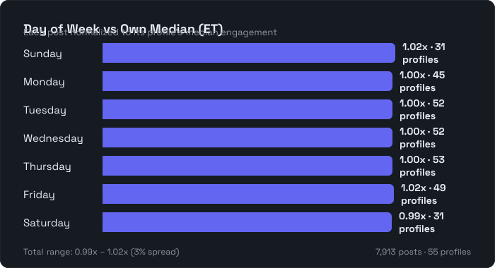
Day of week: the aggregate signal is almost zero
Here’s how each day performs relative to the typical post, after normalizing across all profiles:
| Day | Posts | Profiles | vs own median |
|---|---|---|---|
| Sunday | 463 | 31 | 1.02x |
| Monday | 1,242 | 45 | 1.00x |
| Tuesday | 1,411 | 52 | 1.00x |
| Wednesday | 1,440 | 52 | 1.00x |
| Thursday | 1,469 | 53 | 1.00x |
| Friday | 1,264 | 49 | 1.02x |
| Saturday | 547 | 31 | 0.99x |
The entire range is 0.99x to 1.02x. Three percent spread across all seven days. If “post on Tuesday” is the strategy, the data says Tuesday is worth exactly 0% above baseline. That’s not a strategy. That’s nothing.
And notice the profile counts: weekdays have 45–53 profiles contributing with a median of 22–28 posts each. Weekends have 31 profiles with a median of 7–8 posts each. When I filtered to profiles with 10+ weekend posts, 8 did better on weekends, 11 did worse, and 5 were neutral. That’s not a signal, that’s a coin flip.
But each person’s best day is worth ~2x their worst
Here’s where it gets interesting. When I looked at each profile individually, 50% of people had a 2x or greater gap between their best and worst day. The median gap was 2.0x. One profile had an 8.5x gap.
And the “best day” scattered across all seven days with no real concentration:
| Day | Profiles whose best day |
|---|---|
| Sunday | 7 (13%) |
| Monday | 7 (13%) |
| Tuesday | 10 (18%) |
| Wednesday | 6 (11%) |
| Thursday | 6 (11%) |
| Friday | 11 (20%) |
| Saturday | 8 (15%) |
Friday is the most common best day at 20%, which still means 80% of people’s best day was something else.
The aggregate says day barely matters. The individual data says it matters a lot — it’s just a different day for everyone. Which makes every generic “best day to post” article approximately useless.
A caveat: the day-of-week variance (50% of profiles showing a 2x gap) is highest among infrequent posters and lowest among frequent ones. Some of that “your best day matters” signal could be statistical noise from thin per-day samples rather than a real timing effect. If you’ve only posted 4 times on a Friday and one of them happened to go viral, Friday looks like your best day for reasons that have nothing to do with Friday.
Format: images win, not carousels
This one surprised me. The standard advice is that documents and carousels dominate LinkedIn. Here’s what the per-profile normalized data actually shows:
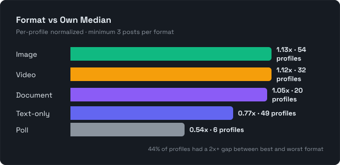
| Format | Profiles | vs own median |
|---|---|---|
| Image | 54 | 1.13x |
| Video | 32 | 1.12x |
| Document/Carousel | 20 | 1.05x |
| Text-only | 49 | 0.77x |
| Poll | 6 | 0.54x |
Visual formats beat text by about 40–45%, which is real. But documents — the supposed king — sit barely above baseline at 1.05x. Images and video both outperform them.
I think what happened is that the “carousels dominate” finding from other studies is really audience-size bias. People who make carousels tend to be high-follower content creators, so carousels look like they get more engagement when it’s really that bigger accounts get more engagement and happen to use carousels. Once you normalize for account size, carousels are fine but not special.
Individually, 44% of profiles had a 2x+ gap between their best and worst format. So again: the aggregate is barely useful, your own data tells a very different story.
Post length: the one thing the aggregate actually gets right
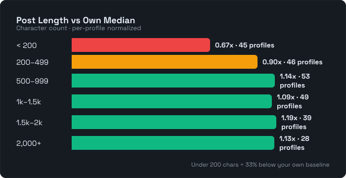
| Length | Profiles | vs own median |
|---|---|---|
| Under 200 chars | 45 | 0.67x |
| 200–499 | 46 | 0.90x |
| 500–999 | 53 | 1.14x |
| 1,000–1,499 | 49 | 1.09x |
| 1,500–1,999 | 39 | 1.19x |
| 2,000+ | 28 | 1.13x |
Short posts (under 200 characters) perform 33% below your own baseline. Posts in the 500–2,000 range perform 10–19% above. This is the one dimension where the aggregate advice (“write longer posts”) holds up even after normalizing.
The sweet spot is 500+ characters. Below that, you’re consistently leaving engagement on the table regardless of who you are.
Posting frequency: more is better, and it’s not close
This was the most surprising finding. The common advice is “don’t post more than 3–5 times a week or you’ll burn out your audience.” I was honestly expecting to see some per-post dilution at higher frequencies.
Nope.
To test this, I looked within the same profiles — comparing their high-output weeks to their low-output weeks. For each profile-week, I computed the average per-post engagement (each post’s engagement divided by that profile’s overall median), then took the median across all profile-weeks in each bucket. To make the comparison intuitive, the table is rebased so 1-post weeks = 1.00x:
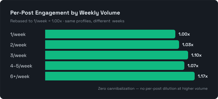
| Posts that week | Per-post engagement (vs 1/week baseline) |
|---|---|
| 1 | 1.00x |
| 2 | 1.03x |
| 3 | 1.10x |
| 4–5 | 1.07x |
| 6+ | 1.17x |
Zero cannibalization. Per-post engagement stays flat or slightly increases at higher volumes. When you’re on a roll, you’re on a roll.
The constraint on posting frequency is quality, not audience fatigue. If you can sustain the quality, the data says post as much as you want.
What I’d do with this
Ignore generic “best time” advice. The aggregate day-of-week signal is 2% at best. That’s not your strategy, that’s rounding error.
Look at your own data. Your personal best/worst day gap is likely 2x, which is worth finding — but it’s your best day, not LinkedIn’s. I built the timing analysis in Flux specifically because the aggregate answer is useless and the individual one isn’t.
Use visual formats. Images and video outperform text by about 40–45% even after normalizing. This is the one piece of standard advice that survived the data.
Write 500+ characters. Under 200 chars is a 33% penalty relative to your own baseline. Say enough to be worth reacting to.
Post more, not less. There’s no per-post dilution from higher frequency. The real limit is whether you can maintain quality, not whether your audience will tune out.
Methodology: 7,913 LinkedIn posts from 63 profiles, June 2025 – June 2026. Engagement = likes + comments + shares (LinkedIn doesn’t expose impressions to third parties). Reposts excluded. All per-post metrics normalized to each profile’s median engagement so large and small accounts contribute equally. Day-of-week analysis adjusted to Eastern Time. Minimum 10 posts per profile, 3 posts per cell for per-profile breakdowns.