12 Simple Google Sheets Sparkline Examples
January 12, 2017
I just finished a project where I was using IPython and Pandas a lot more than spreadsheets. I found that after using Pandas, I started to think about data a little differently. When I returned to Google Spreadsheets, I realized it wasn’t capable of displaying the data in the way that I wanted to. So I took another look at the Google Spreadsheet SPARKLINE function and found that, in many cases, they provide a more informative and much quicker visualization than charts. Once I got started, I figured I would exhaust the possibilities of the feature and share them here so that you can get started with them quickly and easily when you need to.
There are four different types of sparkline charts. I have a section for each:
Horizontal Bar Charts
Single Series Data
Best for: Comparing every cell in a column
Basic Bar Chart
=sparkline(A36,{"charttype","bar";"max",100})
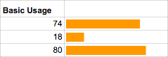
It’s pretty straightforward. Make sure to set the max option so that the bar does not take up the full column.
Reverse Direction with Max Argument and Color
=sparkline(E42,{"charttype","bar";"color1","teal";"rtl",true; "max",max(C$36:C$44)})
rtl (right to left) changes the direction of the bars. Use the max function for the value of max with the data column as the range to set the width limit to the highest value in the data column.
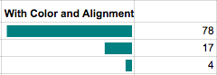
Stacked Series Data
Best for: Comparing multiple columns with each row as parts of whole
Stacked “Versus” Chart
=sparkline(E49:F49,{"charttype","bar";"color1","EB4967";"color2","73A4D3"})
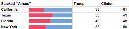
Set the color to hex codes to make visually appealing sparklines. No value for max will set the width of the bar to the width of the cell.
Stacked Bar Chart
=sparkline(E58:H58,{"charttype","bar";"color1","A7DBD8";"color2","69D2E7";"max",max(I$58:I$61);"nan","ignore"})
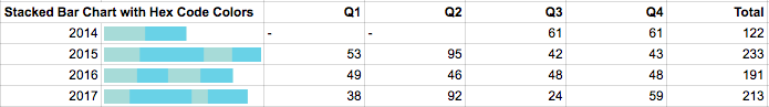
The Q1 and Q2 values for the 2014 row do not have numerical values. Setting nan to “ignore” will exclude these values from the sparkline bar chart. The max option is set to the highest value of the Total column.
Line Charts
Single Series (Y) Data
Best for: Displaying time series data where values change over consistent time intervals
Standard Line Chart and the Effects of ymin
=SPARKLINE(B3:G3,{"charttype","line"; "color","indigo"; "linewidth",2})
=SPARKLINE(B3:G3,{"charttype","line";"color","indigo"; "ymin",0})
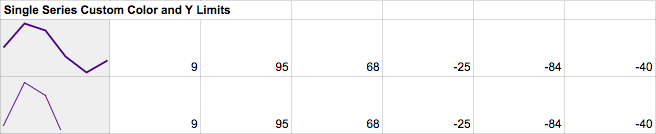
This chart uses a custom color and linewidth. It also demonstrates how to change the chart’s background color by changing the cell’s background color. Both charts display the same data, but because it sets the ymin option to 0, the chart looks much different. Be careful when setting limits and cell dimensions. These adjustments can make the data appear to say different things.
Line Chart with Conditional Coloring
=SPARKLINE(C7:H7,{"color",if(H7>C7,"green","red");"ymax",100; "linewidth",2})
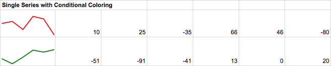
The color is set to an if formula. This formula compares the first and last values of the series, and if the last value in the series is greater than the first value, the line color option is set to green; and if not, the color is set to red. The slope formula is also good for this, but it is better with X,Y series data.
Dual Series (X and Y) Data
Best for: Displaying time series data where values change over inconsistent time intervals
Line Chart with Conditional Coloring
=SPARKLINE(C12:H13,{"color",if(slope(C13:H13,C12:H12)>0,"green","red"); "linewidth",2; "ymax",25; "xmax",15})
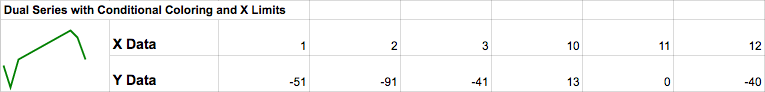
There is a lot going on here, but it builds on the previous example. The slope function is used to set the color of the line. If the slope is greater than 0 the line is green; else, it is green. Additionally, ymax and xmax are set to values greater than any data value. This creates a margin around the line chart.
Line Drawing… Because you can
=SPARKLINE(C26:O27,{"color","red"; "linewidth",8})
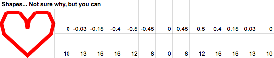
The lines will follow the X and Y coordinates even if they are not consecutive. Go nuts!
Win/Loss Charts
Best for: Displaying binary data like wins and losses
Custom Colors and Colored Axis
=SPARKLINE(B$2:G$2,{"charttype","winloss";"color","teal";"negcolor","grey";"axis",true;"axiscolor","black"})

Colors help draw attention to the data more quickly than just shapes.
Custom Colors and Colored Axis
=SPARKLINE(B$2:G$2,{"charttype","winloss";"color","grey";"axis",true;"axiscolor","black";"firstcolor","teal";"lastcolor","yellow"})

The firstcolor and lastcolor options are a good chance to use custom coloring. These can be helpful for summaries of a series of data like whether a team was over or under .500.
Custom Colors and Colored Axis
=SPARKLINE(B$6:G$6,{"charttype","winloss";"color","grey";"axis",true;"axiscolor","black";"nan","ignore";"empty","ignore"})

The nan and empty options determine how non-numeric or empty data is treated. In this case, the first cell is empty, and the fifth cell is text. Both cells are ignored.
Column Charts
Best for: Comparing a series of values against each other
Dealing with Negative Values
=SPARKLINE(B$2:G$2,{"charttype","column";"color","teal";"negcolor","purple"}) =SPARKLINE(B$2:G$2,{"charttype","column";"color","teal";"ymin",0})
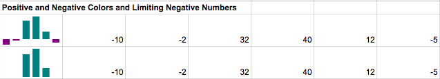
Column chart sparklines offer two ways to call out negative values. The first is to set the negcolor value and the second is not to display them altogether by setting the ylim value to 0.
High and Low Value Accent Colors
=SPARKLINE(B$2:G$2,{"charttype","column";"color","teal";"negcolor","purple";"lowcolor","fuchsia";"highcolor","aqua"})
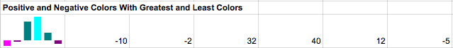
The highcolor and low color options make is easy to identify the high and low values in the data series.
Bonus: Hex Color Options
Google Spreadsheets is great in that it allows you to customize a lot of the visual display. Here are a few nice color palettes to make your data a bit more visually pleasing. For more, check out: http://www.colourlovers.com/palettes
#69D2E7 #A7DBD8 #E0E4CC #F38630 #FA6900
#41F4E3 #73A4D3 #F0D9A8 #70109 #EB4967
#00A0B0 #6A4A3C #CC333F #EB6841 #EDC951
#ECD078 #D95B43 #C02942 #542437 #53777A
I hope that covers any visualization that you might need to use. Let me know in the comments if you are having any trouble. Tomorrow I will publish a post on how to make funnel diagrams using the Sparkline Function.